

Of course if you can't find the right Chartreuse decor piece for your home, there's always the magic of spray paint, remember those too grown up feeling bookends? Once I sprayed them a happy shade of Chartreuse, they looked perfect in Avery's room.
Totally smitten with how the homes below incorporated the chartreuse color in bold fun ways into the color palette of the room.
via HoneseltyWTF
via Domaine Home
The color palette infused with aqua, chartreuse and grey is right up my homes color palette! This just screams happy relaxing and playful.
image via UrbanComfort
Remember have fun with color in your home! Are you totally crushing hard on the color Chartreuse too? What's your current color crush?






It looks so good against gray.
ReplyDeleteThose two colors were for sure made for each other!
DeleteI love all of your choices, Katrina. Chartreuse is one of my favorites, too. Have a great weekend!
ReplyDeleteAlissa
Aren't those rooms just dreamy and love their use of color! Have a fun weekend too, and if you haven't already be sure and enter my giveaway!
DeleteI'm a sucker for symmetry, I love those four prints perfectly spaced right over each of the four shelves.
ReplyDeleteallsquaredup.blogspot.com
I love symmetry too, totally trying to break my habit with my use of various pillows..baby steps :)
DeleteI love this colour! I chose something very close to this for my kitchen walls, believe it or not! It really makes our wood cabinets pop and also looks great with stainless steel & black accents. We didn't have a ton of wall space to paint, so it's not overwhelming. I've also picked up some tea towels too, such a great pop of colour.
ReplyDeleteLovin your chartreuse room inspirations! Right now I am totally into green. I'm so into that color that I am considering sewing up some curtains for my living room in a dark shade. Love it and it's so out my norm!
ReplyDeleteI say go for it!! I'm sure green drapes will look so good, I'm currently working on painting a vintage dresser a shade of emerald! Can't to share :)
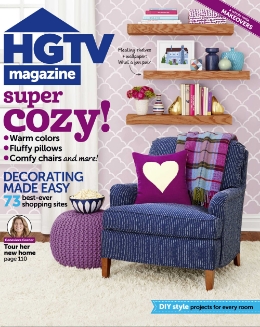
DeleteOff topic but wanted to let you know...just got a copy of the October HGTV magazine and there YOU are!!! How exciting!
ReplyDeleteHi Denise! I'm excited too! Finally got my hands on a copy this morning and just filled with so many emotions! I hope you enjoy the article :)
DeleteLovely color palette. The chartreuse is beautiful, yes. I love cozy, yet colorful spaces.
ReplyDeleteMe too!
DeleteI love chartreuse as well. Chartreuse was part of my wedding colors and I have various pops throughout my house. Such a pretty color.
ReplyDeleteooh sounds pretty, loved that is was apart of your wedding!
DeleteLove that color
ReplyDeleteIsn't such a happy color!
Delete