

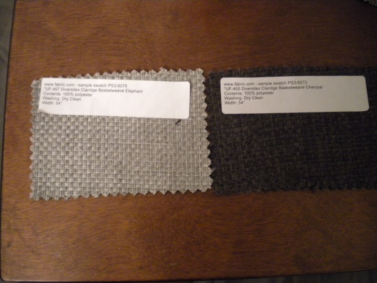
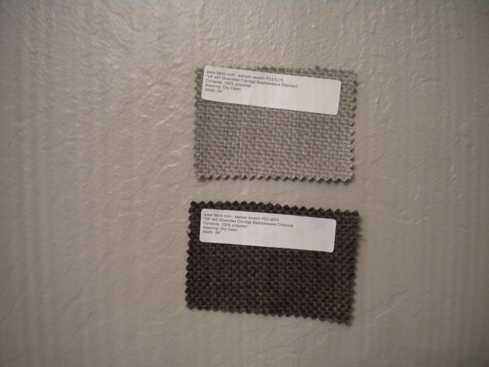
Here's how both fabric swatches look against of bedrooms gray walls.
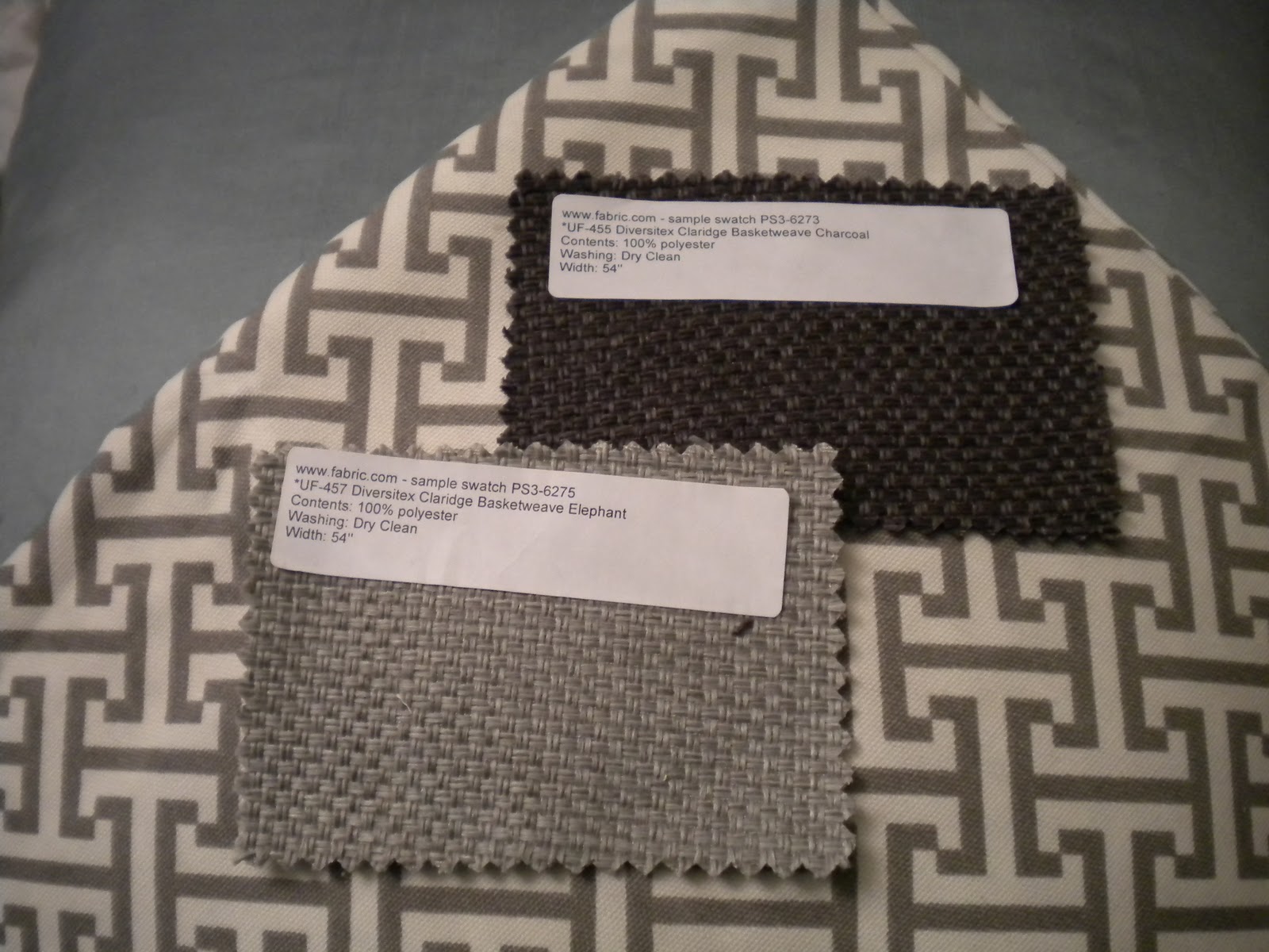
The blue in the background represents pillows that will be on our bed and the { white & grey fabric }Waverly Cross Section Grey will be made into Euro pillow covers.
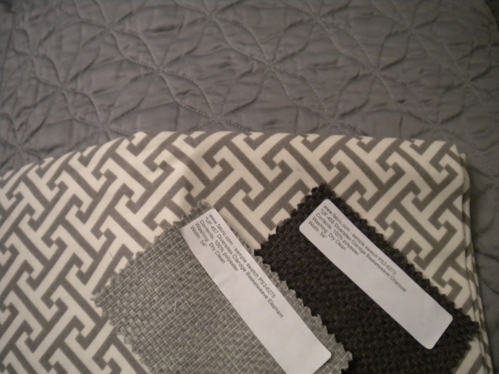
This is how the fabric swatches look with our coverlet, that will be at the bottom of the bed.
If we end up using the lighter fabric Elephant, I will use black nail heads. If we use the darker fabric Charcoal, I will use pewter nail heads. So either the way the nail heads will pop a little off the fabric.
Now that you've seen both fabric swatches, which fabric do you like better for a headboard & why?













I am personally in love with both colors, but think the high contrast "pop" of the darker one would really draw your eyes to your head board past your bedding making it a real focal point in the room.
ReplyDeleteI prefer the darker. Just like Clarksongirl mentioned, it's a really nice contrast with the other elements. This is going to be one gorgeous room.
ReplyDeleteDark! I like the contrast. :)
ReplyDeleteI loved the dark before and I am still fond of it. I say go darker for the contrast; I also agree the room is going to be outstanding when you are done.
ReplyDeleteVery good points! I can't wait to show my comments the votes so far....
ReplyDeleteSince the walls color is so similar to the elephant...I would go darker...BUT I love the lighter one...;)
ReplyDeleteI LOVE LOVE LOVE the darker one!
ReplyDeletedefinitely the darker!
ReplyDeleteYou know, I'd usually say lighter, but the darker one just looks so good against everything!! Mrs. Chic, I think I'm going to be forever envious of your projects and house. I hope you don't mind! ;)
ReplyDeleteIt might be because it's raining outside, but I'm feeling the darker color- it just seems so cozy.
ReplyDelete